How we use light and colour to set the mood
Commercial photographers are lightsmiths, experts at lighting a scene to perfection in order to display the subject of the captured image in exactly the right way. With a comprehensive selection of lighting equipment and techniques at our disposal, we know exactly how to display your product or service to capture the attention and imagination of your audience. When thinking about product photography, your first instinct might be thinking of a product displayed on its own against a white background, which might be appropriate for an online catalogue, but it’s not always the most effective way to show your product at its best. As experienced commercial photographers, we understand that the use of colour can have more influence than you might think.
How colour communicates
We’re all products of evolution. In nature, colour communicates in a language of its own and despite our evolved brains, we still understand its message, albeit at a subconscious level. In nature, bright colours are used to attract attention and our brains instinctively take notice. So it’s no surprise that colours in photography can be used to attract attention to the subject of the picture. While we’re programmed to take notice, the meaning a colour has can vary depending on several factors.
In commercial photography, advertising and marketing, different colours are known to have different effects on the audience and understanding which colours to use and how to use them can be a powerful tool in influencing the perception of your brand and your products. A knowledge of which colours to use in any given context can give a commercial image added impact if used correctly.
Using colour in commercial photography
You only have to look at brand logo’s and TV advertising to see the subtle and not so subtle uses of colour to suggest to an audience how they’re supposed to feel towards a product or brand. The colour white suggests innocence, cleanliness and purity, so it’s no surprise that white is used a lot in cleaning and hygiene product ads, also in messages about technology. Green is a colour reflecting harmony, peace and healing amongst other things, so it’s no surprise you see a lot of it in hospital decorating. The use of colour to influence mood is everywhere if you look for it.
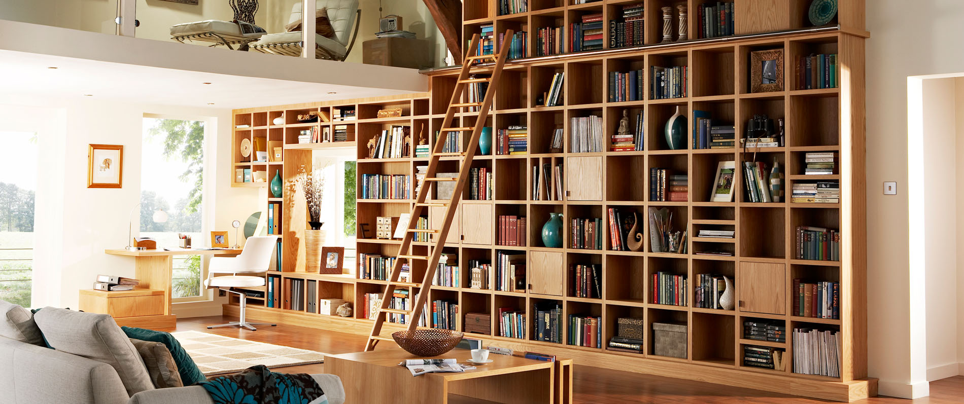
The practical uses of colour in commercial photography stem from understanding the message you’re trying to convey when you commission us for your photography project. If your brand is bold and energetic, our skilled stylists might suggest the use of reds in the background, props or lighting which contribute to the ‘feel’ of the photograph in room set photography for example. Should your product be of a premium nature, hues of orange or purple might find their way into the captured imagery instead, reflecting an image of opulence, wealth and luxury.
If you’d like to discuss how we can use colour in a commercial photoshoot to give your business and your products added impact in your advertising campaigns. Get in touch with us to find out what we can do for you.


